
Every year, when the Color of the Year announcements come out, I get messages from clients asking some version of the same question:
“Is this a color I should actually use — or just admire from afar?”
After years of staging homes and helping homeowners design spaces they truly love, I’ve learned this: color is never the problem — how it’s used is. The same color that adds warmth, flow, and sophistication in one home can feel overwhelming or out of place in another if it’s applied without intention.
The 2026 Colors of the Year are especially interesting because they’re versatile, grounded, and layered — which makes them powerful tools when used thoughtfully. Whether you’re preparing to sell or planning to stay and enjoy your home, these colors can absolutely work for you when applied with purpose.
Here’s how the 2026 Colors of the Year from Pantone, Sherwin-Williams, Behr, and Benjamin Moore can work beautifully when used intentionally.
Pantone Color of the Year 2026: Cloud Dancer
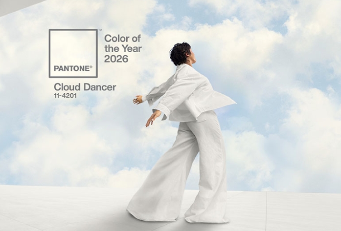
Cloud Dancer is a soft, airy off-white with gentle warmth — clean, calm, and quietly elegant.
Best use in staging:
This is a dream base color. Cloud Dancer allows light to bounce beautifully, makes spaces feel larger, and provides a neutral canvas buyers can easily imagine themselves in.
- Ideal for main living areas
- Excellent for open-concept homes
- Supports natural wood, stone, and textured styling
Best use in decorating:
For homeowners, Cloud Dancer works as a whole-home neutral that feels warmer and more inviting than stark white — especially when layered with personality through furnishings and art.
Lisa takeaway:
This color disappears in the best possible way — it lets the home shine.
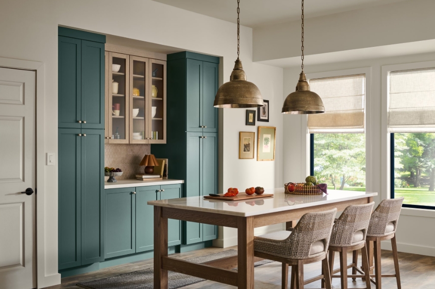
Sherwin-Williams Color of the Year 2026: Universal Khaki
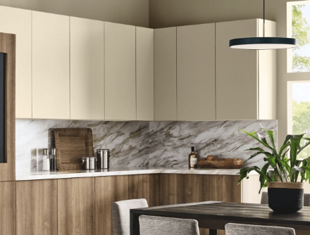
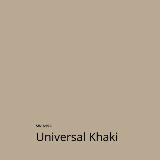
Universal Khaki is a grounded, earthy neutral that sits between warm beige and soft green undertones.
Best use in staging:
This color works well when used selectively to create warmth and subtle contrast without overpowering a space.
- Accent walls in dining rooms or dens
- Ideal for transitional spaces
- Grounds a home without darkening it
Best use in decorating:
Universal Khaki is extremely livable. It brings depth and comfort and pairs beautifully with natural textures, leather, and warm metals.
Lisa takeaway:
This is a stabilizing color — perfect for creating flow and cohesion.
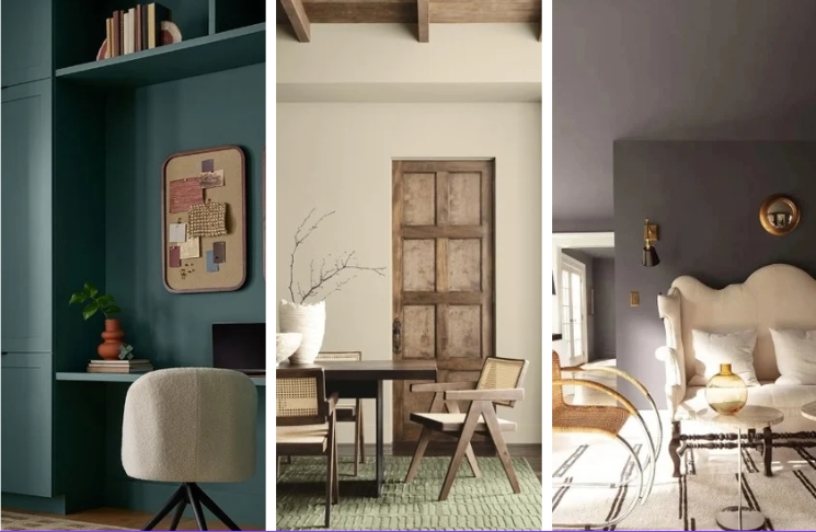
Behr Color of the Year 2026: Hidden Gem
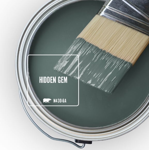
Hidden Gem is a deep blue-green with richness and personality.
Best use in staging:
This is not a full-home color for selling — but it’s powerful when used intentionally.
- Powder rooms
- Styled vignettes
- Accent furniture or artwork
It adds sophistication and memorability when used sparingly.
Best use in decorating:
For homeowners, Hidden Gem makes a stunning statement wall or feature room, especially when balanced with lighter neutrals elsewhere.
Lisa takeaway:
In staging, this color whispers. In decorating, it can speak boldly.
Benjamin Moore Color of the Year 2026: Silhouette
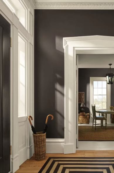
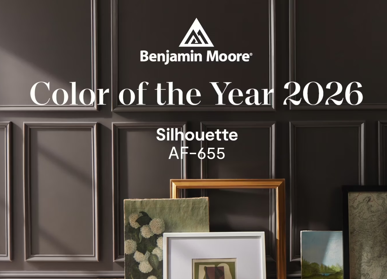
Silhouette is a moody, softened charcoal with warmth and depth — dramatic yet refined.
Best use in staging:
Used carefully, Silhouette adds contrast and elegance.
- Dining rooms
- Offices
- Feature moments that highlight architecture
It works best in homes with good natural light.
Best use in decorating:
For homeowners, this color is ideal for those who love depth and atmosphere without going fully dark or cold.
Lisa takeaway:
This color defines spaces — it should never overpower them.
Staging vs. Decorating: Why Intent Matters
The same color behaves very differently depending on the goal.
When staging a home:
- Color should guide buyers, not define taste
- Neutrals lead, accents support
- Flow from room to room is critical
This is where color mapping comes in — subtly leading buyers through a home using tone and temperature rather than bold statements.
When decorating a home:
- Color reflects personality
- Depth and contrast are welcome
- Rooms can have stronger identities
The key is still cohesion — not every room needs to match, but they should belong together.
Creating Flow With the 2026 Colors of the Year
A successful palette uses:
- 1–2 core neutrals (like Cloud Dancer or Universal Khaki)
- 1–2 deeper accent tones (like Hidden Gem or Silhouette)
For decorating:
These colors can move from room to room at different intensities — paint in one space, textiles or art in another.
For staging:
Walls remain neutral, while Color of the Year shades appear through styling, art, and accessories — creating continuity without distraction.
This approach builds interest and emotional comfort.
If you’re feeling inspired by these colors but unsure how to use them in your home, I’d be happy to help.
Whether you’re:
- Preparing a property for sale and want color to quietly guide buyers through the space, or
- Decorating your own home and looking for a cohesive palette that flows from room to room while still reflecting your personality
I work with clients to create intentional color plans — from subtle color mapping for staging to layered, livable palettes for everyday life.
Because great color isn’t about following trends.
It’s about using them in a way that makes a home feel balanced, inviting, and connected.
💛
Lisa
Home Staging by Lisa
Stage to Sell | Style to Live
Home Staging by Lisa – is a trusted partner in the Chicago Western Suburbs for home staging and decorating. They specialize in helping agents and their clients achieve optimal returns on investment, while also offering homeowners a personalized redesign service to create spaces they love coming home to. Servicing Chicagoland areas of Addison, Bartlett, Bensenville, Berwyn, Bloomingdale, Bolingbrook, Brookfield, Burr Ridge, Carol Stream, Clarendon Hills, Countryside, Darien, Downers Grove, Elmhurst, Geneva, Glen Ellyn, Glendale Heights, Hanover Park, Hinsdale, Lagrange, Lombard, Lisle, Naperville, Oakbrook, Oakbrook Terrace, Oak Park, Roselle, St. Charles, Streamwood, Villa Park, Warrenville, Western Springs, Westmont, Wheaton, Winfield.